Published -

ChowXpress

Project Overview

Client: ChowXpress
Role: UI/UX Designer
Duration: 4 weeks
Platform: Mobile App (iOS/Android)

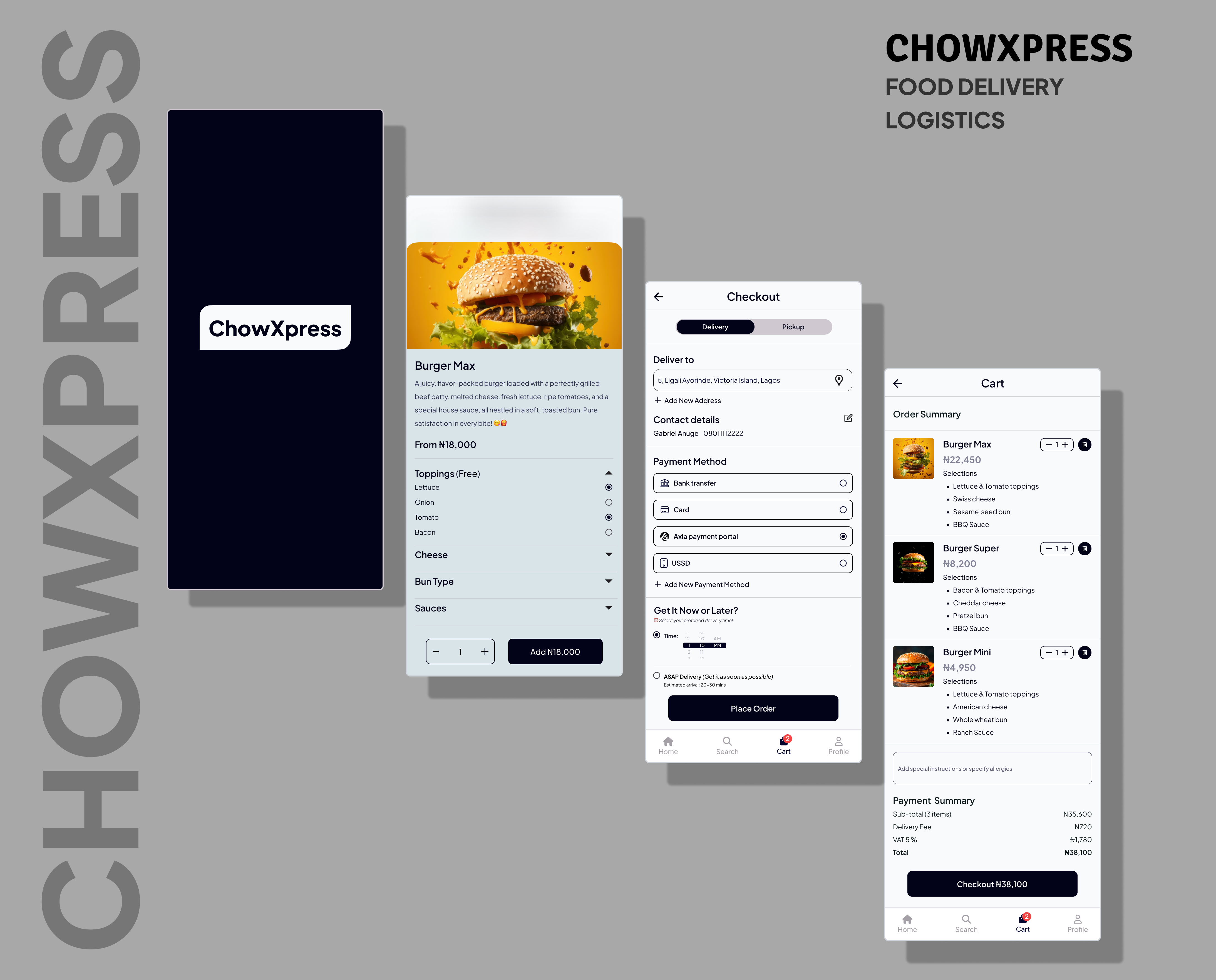
ChowXpress is a fast-growing food delivery startup aiming to provide users with a seamless, fast, and intuitive ordering experience. I was brought on to redesign their mobile app interface with a user-centered approach, streamlining the ordering process from discovery to checkout.

Problem Statement

Users were dropping off at various points in the order journey, especially after viewing food details and during checkout. The old design lacked visual hierarchy, consistent flow, and modern aesthetics.

Goals

  • Create a visually appealing homepage that encourages exploration
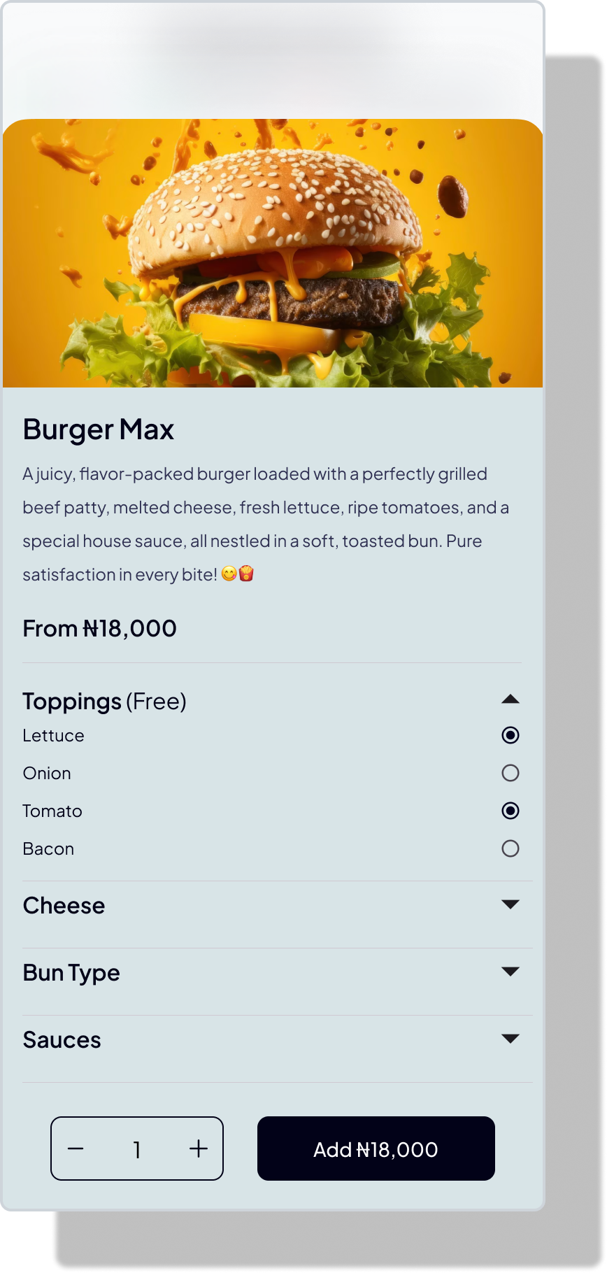
  • Improve food detail layout for quick scanning and decision-making
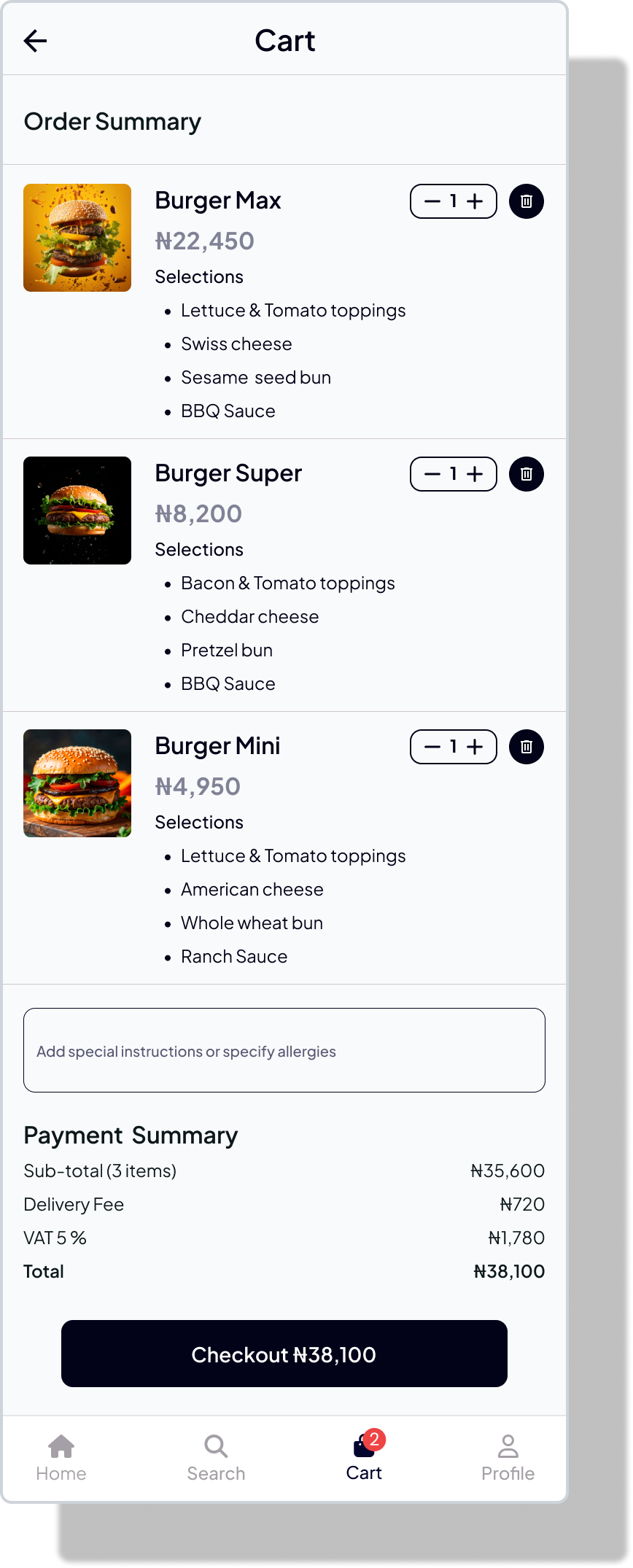
  • Simplify the cart and checkout flow to reduce friction
  • Ensure consistency and responsiveness across screens

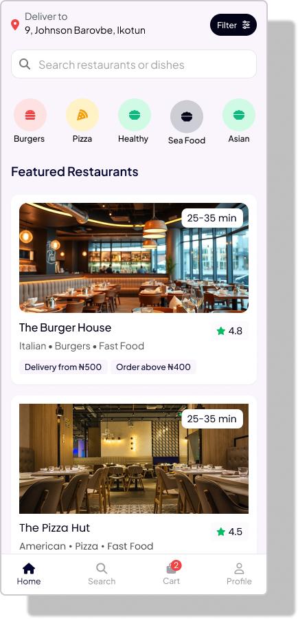
1. Homepage – Discover Food Easily

The homepage serves as the gateway to cravings. I focused on visual richness, easy navigation, and smart categorization.

Key Features:

  • Prominent search bar at the top
  • Curated categories like "Top Picks," "Near You," and "Budget Meals"
  • Interactive banner promoting deals and restaurants
  • Sticky bottom navigation for quick access

UI Decisions:
A card-based layout was used to allow for thumb-friendly scrolling and to highlight food images, which we found crucial in influencing user decisions.

2. Food Description – Clear, Crave-Worthy & Actionable

This page provides a deep dive into each menu item, ensuring users get all the info they need without feeling overwhelmed.

Key Features:

  • High-resolution image with slight parallax effect
  • Ingredients & dietary labels (e.g., spicy, vegan, etc.)
  • Add-ons and customization options (e.g., extra cheese, spice level)
  • Prominent “Add to Cart” CTA

3. Cart Page – Review Before You Checkout

The cart screen needed to balance clarity with flexibility for edits.

Key Features:
  • Clear breakdown of items, quantity selectors, and total price
  • Ability to add special instructions or remove items
  • Suggestive upselling like drinks or desserts
  • Proceed to checkout CTA fixed at the bottom

4. Checkout – Frictionless and Focused

This is the final step, so we kept it lean and anxiety-free.

Key Features:
  • Address confirmation
  • Delivery time estimates
  • Payment options with icons for faster recognition
  • Transparent cost breakdown
  • CTA: "Place Order" button in brand color

Tools Used

  • Figma (Design & Prototyping)