Published -

MedAid

Overview

Project Name: MedAid
Role: Lead UX/UI Designer
Project Type: HealthTech Mobile App
Duration: 4 Weeks (Research → Wireframes → High Fidelity Design)

Medaid is a mission-driven mobile app designed to connect individuals who cannot afford medical supplies with trusted donors, partners, and healthcare providers. My role was to lead the end-to-end design process, from user research to high-fidelity mockups, with a clear goal: make healthcare more accessible, one tap at a time.

Problem

Millions of people in low-income communities struggle to access essential medical supplies. Existing platforms either cater to paid users or have complex interfaces that are not beginner-friendly.

We asked ourselves:
"How might we simplify the process of requesting and receiving medical aid for users with limited digital literacy or financial access?"

Goals

  • Design an intuitive mobile experience that requires minimal learning curve
  • Streamline the request and donation processes
  • Build trust through transparent tracking of aid and medical supply deliveries
  • Ensure accessibility across low-bandwidth environments

Key Screens & Experience Flow

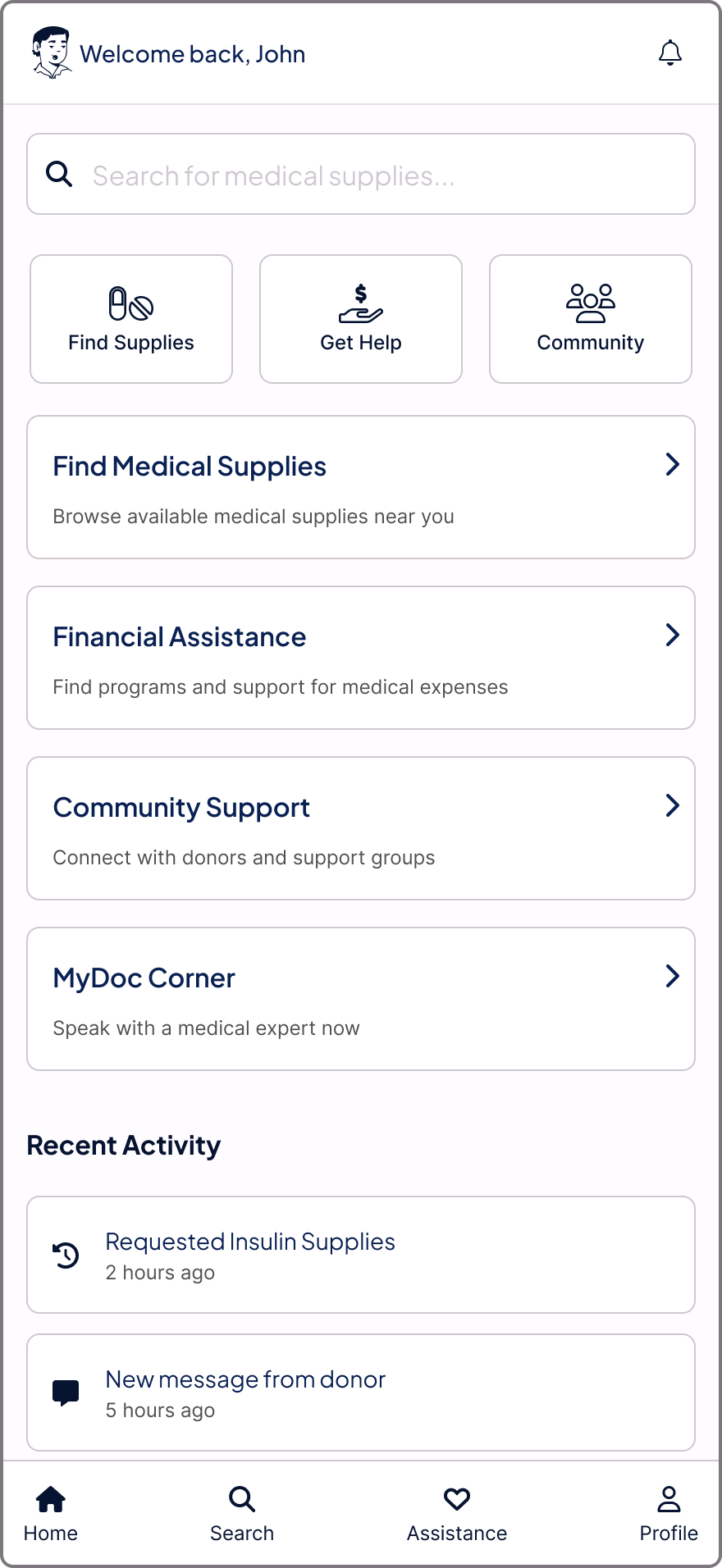
1. Homepage – Know Your Options, Instantly

Design Focus: Simple navigation and personalized options

Features:

  • Quick Actions: Find Medical Supplies, Request Aid, Track Request, Get Help
  • Recent Updates: View recent activity
  • Search bar

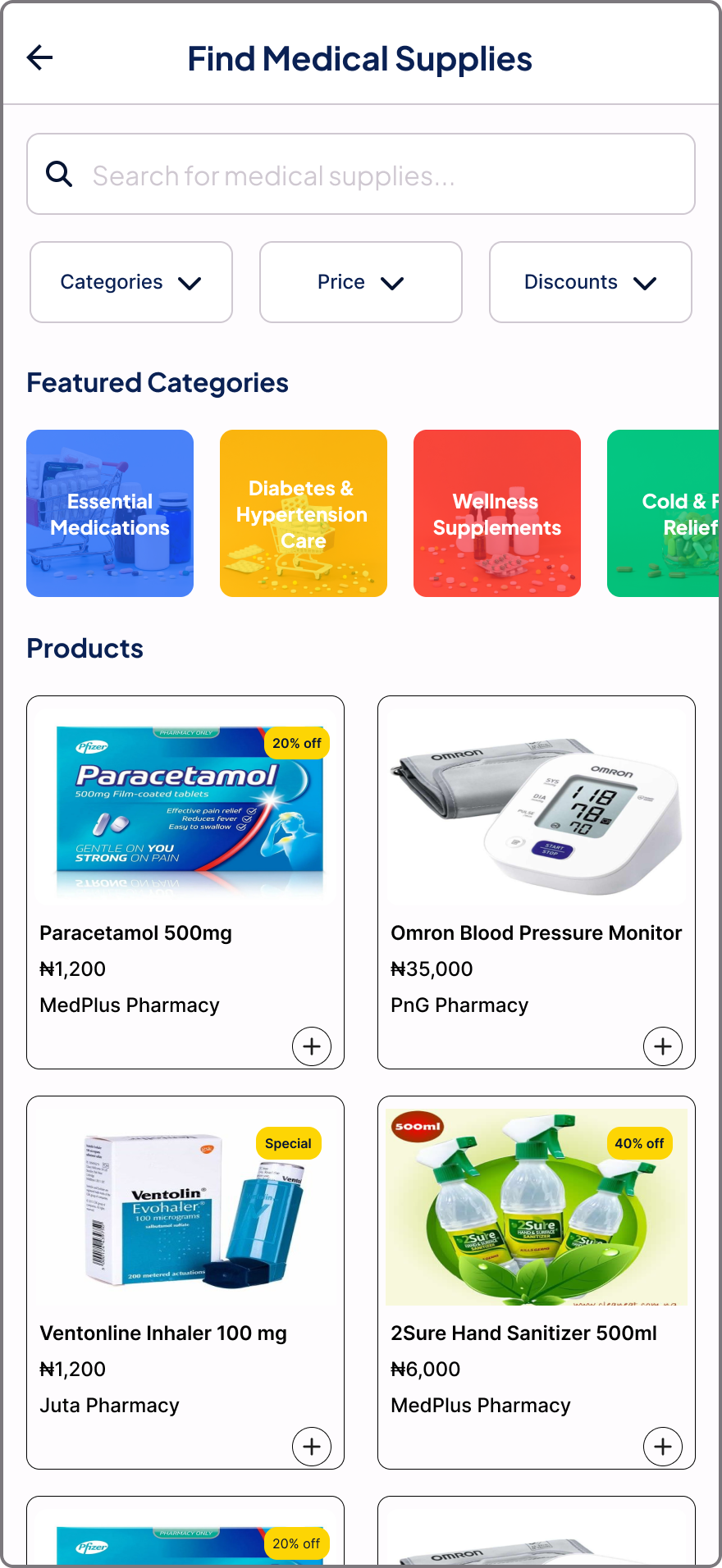
2. Find Medical Supplies Flow – Fast, Guided, Human-Centered

Design Focus: Reduce scroll fatigue with a step-by-step supplies search flow

Features:

  • Smart page with minimal required fields
  • Filter and search tools
  • Featured categories (e.g., diabetes kits, wellness supplements, cold & Flu relief , etc.)
  • Products page

3. Financial Aid Flow – Build a Bridge, Not a Wall

Design Focus: Create an easy and trustworthy assistance interface

Features:

  • Find Available Aid Programs
  • Simplified form application
  • Payment and pickup logistics integrated

4. Order Tracker – Empower Through Transparency

Design Focus: Give users clarity and peace of mind

Features:

  • Track aid status: Accepted → Processing → Shipped → Delivered
  • Chat support and update notifications
  • Delivery person details and arrival ETA

Design Process

Research Phase

  • User Interviews: 10 participants (including patients, caregivers, and health volunteers)
  • Pain Points Identified:
    • Long aid approval times
    • Confusion on how to apply
    • No clarity on status updates

Wireframing

  • Sketched multiple flows on Figma and FigJam
  • Prioritized a user's goal to purchase medical supplies
  • Conducted quick usability testing with low-fidelity wireframes

High-Fidelity Design

  • Designed with Figma
  • Color palette focused on warmth (greens, soft reds) and trust
  • Typography: Large, readable fonts for accessibility

Impact & Results

While the app is in pre-launch, early testing with stakeholders showed strong promise:

  • 92% of users found the app easier than traditional aid forms
  • 83% felt more confident using the tracker compared to phone follow-ups
  • Increased donor interest after introducing verified urgent requests

Tools Used

  • Figma (UI Design & Prototyping)
  • FigJam (UX flow)
  • Google Docs (Research Statement and User Research)
  • Google Form (User Survey)
Full report available here

Want to collaborate on projects like this? Let’s connect!