The WakaGo landing page was designed to convert first-time visitors into app users—whether they’re looking to book a ride or sign up as a driver. I led the design of the page to align with the app’s bold, friendly identity and optimize it for trust, clarity, and downloads.
Page Goals
Establish trust in the WakaGo brand
Clearly communicate benefits and how the service works
Encourage app downloads and driver sign-ups
Provide visual consistency with the mobile experience
Page Structure & Design Highlights
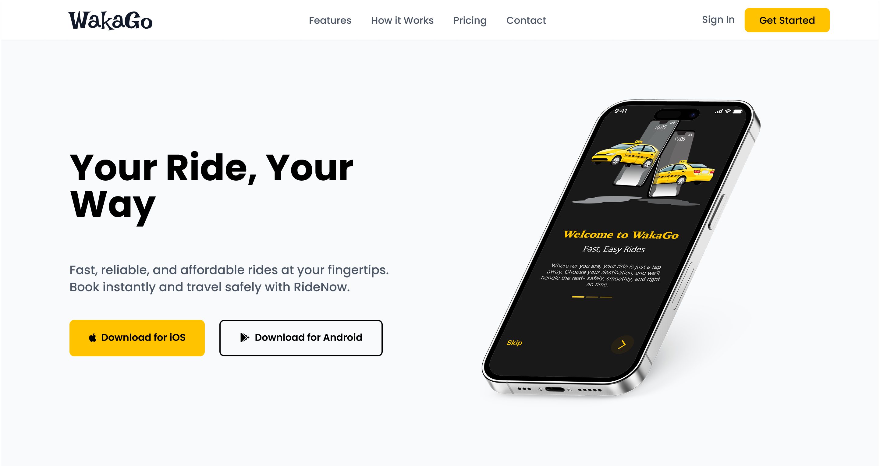
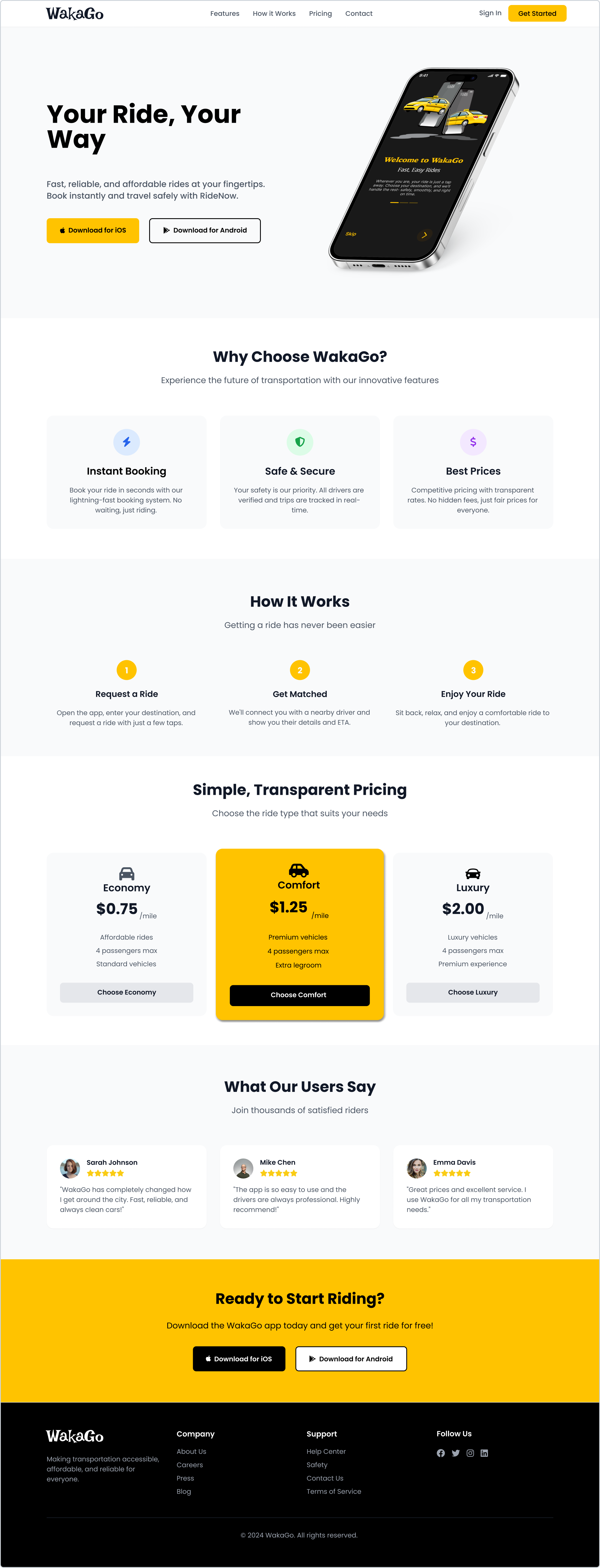
1. Hero Section
Headline: “Your Ride, Your Way.”
Subtext: Short and strong messaging that introduces WakaGo as a local-first ride-hailing app
Visuals: Mockup of the app interface
CTAs: App Store and Play Store download buttons
Background: Clean white #FFFFFF with warm yellow CTA button (#FACC15)
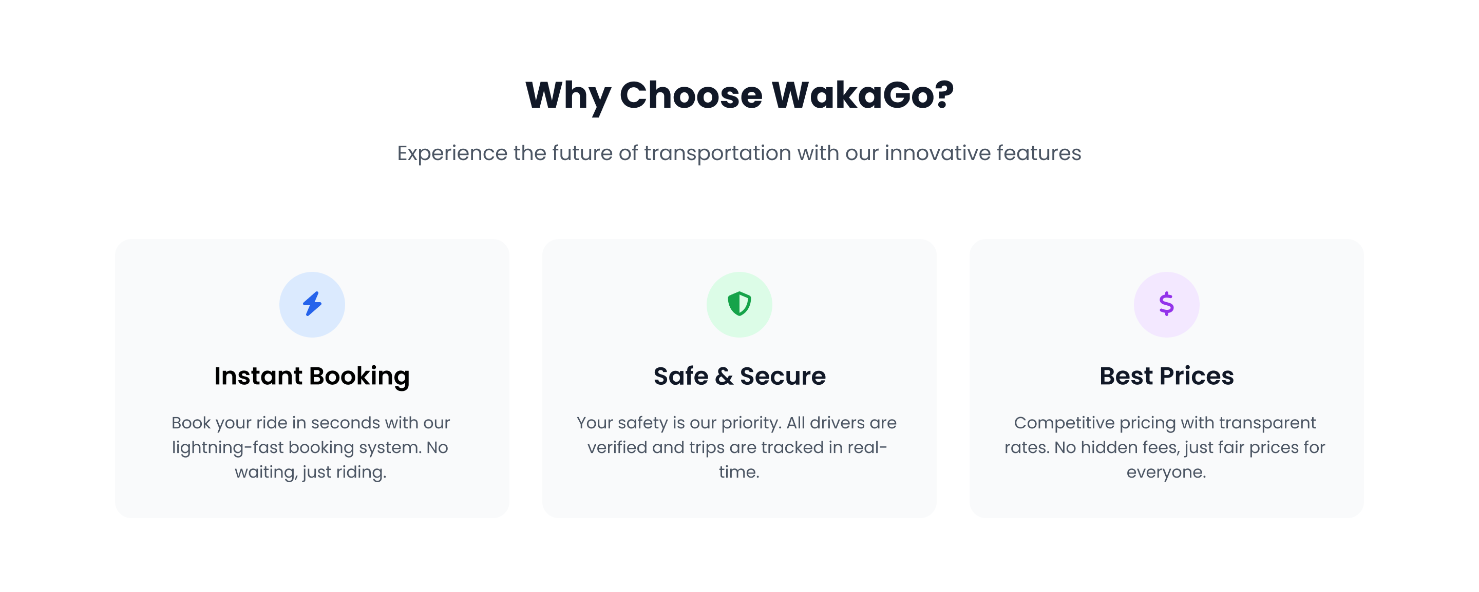
2. Why Choose WakaGo
Three cards communicate the key value propositions of the platform:
💡 Design Note: Cards use icons, brief headers, and concise descriptions with a soft gray background (#F9FAFB) to maintain clarity and spacing.
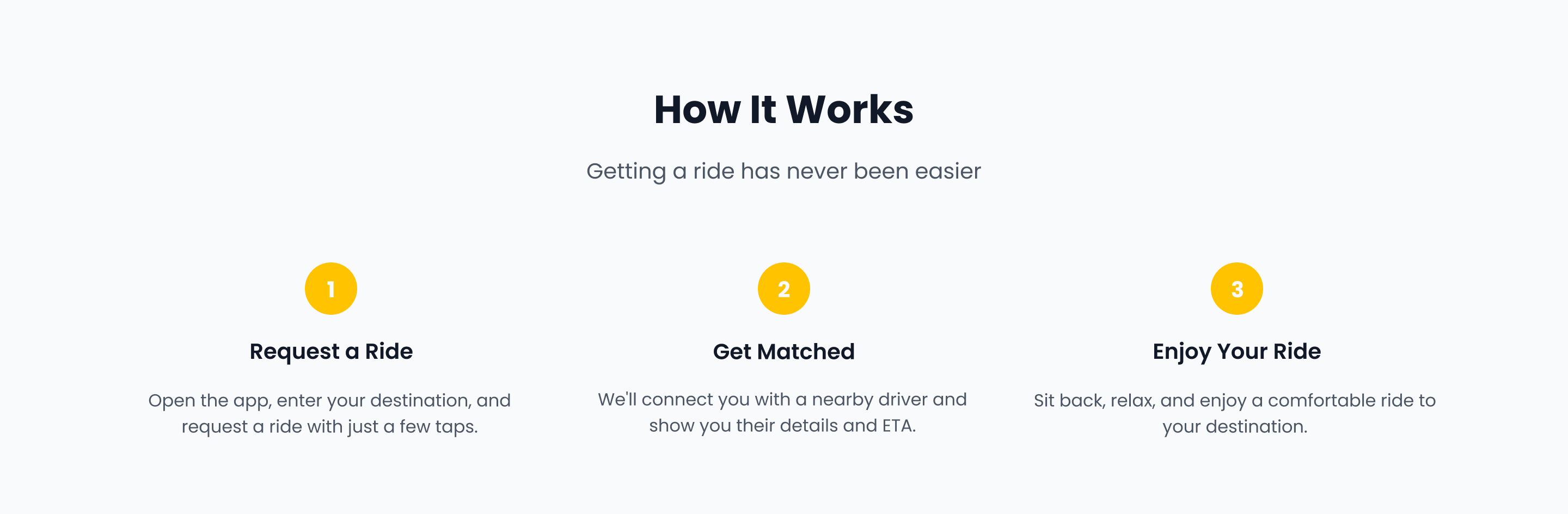
3. How It Works
A visual step-by-step guide that shows how easy it is to use WakaGo:
Request a Ride – Enter pickup and destination
Get Matched – Instantly connect with a nearby driver
Enjoy Your Ride – Sit back and arrive safely
💡 Design Note: Numbered icons and a zig-zag layout guide the eye naturally while maintaining mobile responsiveness.
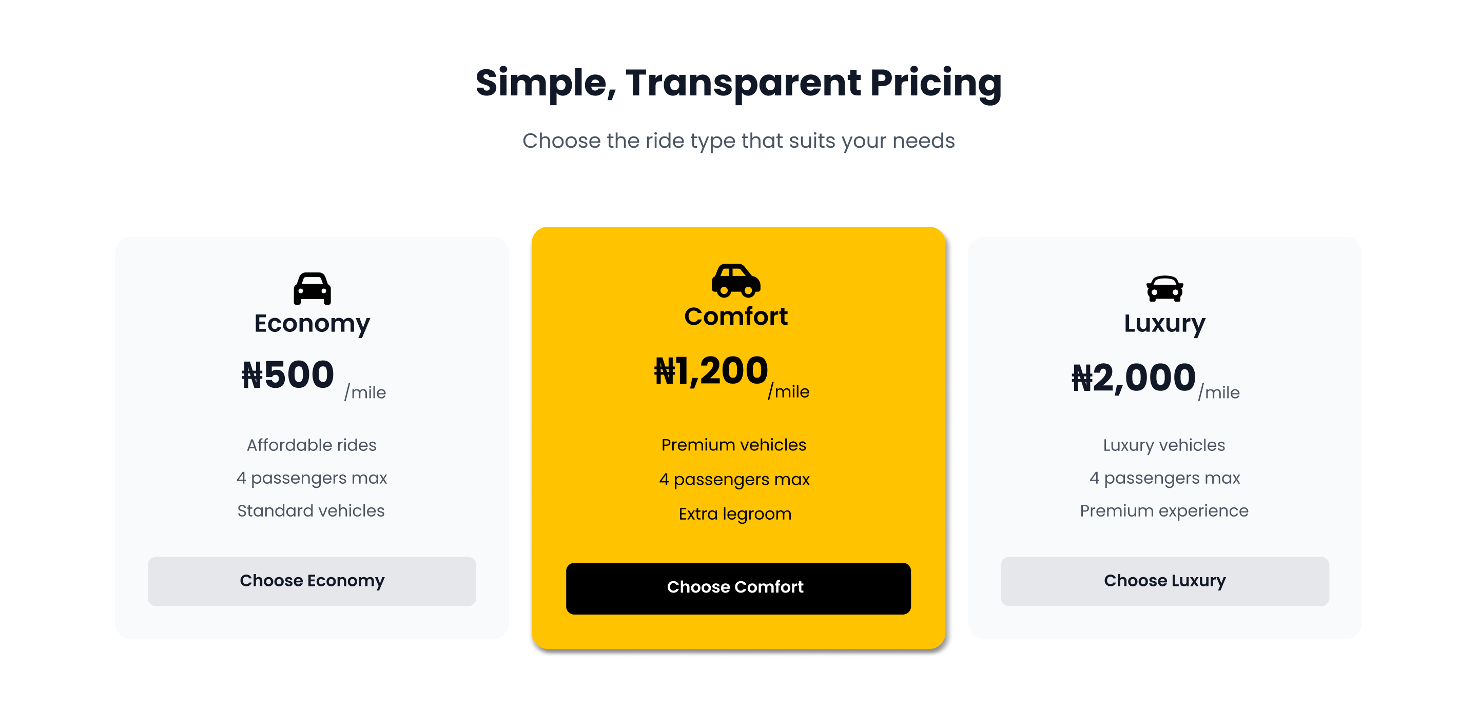
4. Ride Pricing Options
A single featured card breaks down WakaGo’s ride categories:
Economy – Affordable daily rides
Comfort – Premium rides with extra legroom
Luxury – Executive vehicles for special trips
💡 Design Note: Each pricing tier has its own accent color and subtle icon to help users visually compare options.
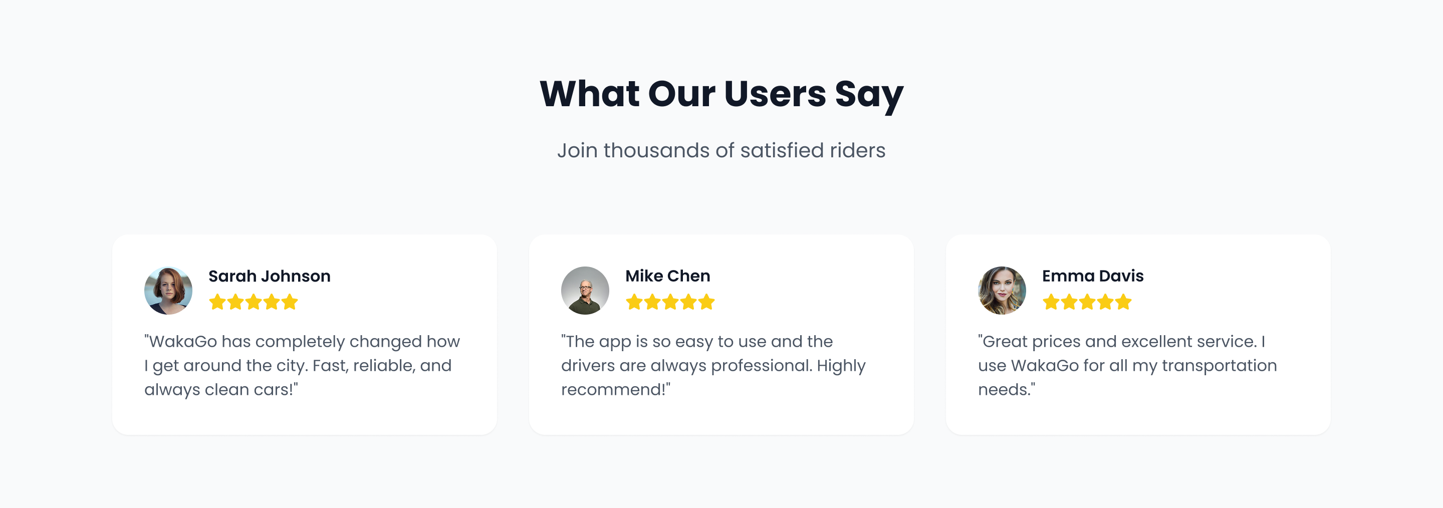
5. Testimonials
User stories highlight satisfaction and trust:
Real names and photos for social proof
Brief quotes like “Cheaper than the others and just as fast.”
Star ratings and ride counts
💡 Design Note: Testimonials are placed against a muted light-gray background to make them feel personal and calm the visual flow.
6. Ready to Start Riding?
This closing section serves as a conversion anchor:
Headline: “Ready to Start Riding?”
Subtext: A short call-to-action inviting users to download the app
CTAs: App Store and Play Store buttons, repeated from the hero section for convenience
Design: Bright yellow #FACC15 background draws attention over black text #000000 and buttons for clean contrast
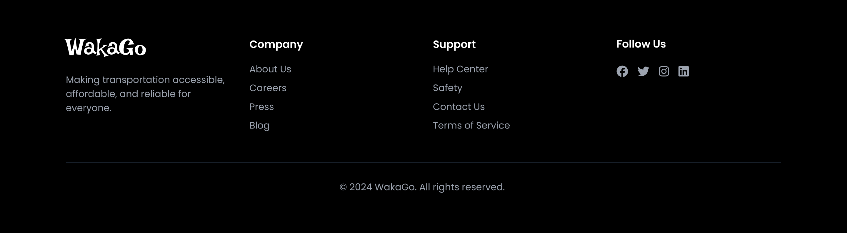
7. Footer
Includes:
Brand logo
Navigation links: Home, About, Contact, Privacy
Social media icons
Background: Black #000000 with white text for high contrast
Visual & UX Decisions
Poppins Font ensures readability and modern aesthetics
Yellow CTA Buttons (#FACC15) appear consistently to train user expectation
Color palette supports focus on important areas without visual noise
Spacing and mobile responsiveness ensure great experience across devices
Impact & Results
Page prototype tested with target users had a 91% CTA click-through rate from the first fold
Users described the site as “clean,” “easy to understand,” and “local but polished”
The pricing card helped reduce questions about ride tiers during interviews
Conclusion
The WakaGo landing page is built to do one thing well: convert interest into action. By clearly showcasing what the brand offers and how to use it; through relatable language, clean UI, and smart content hierarchy. It becomes an effective digital entry point into the WakaGo ecosystem.