WakaGo is a Nigerian ride-hailing app designed for fast, safe, and affordable movement within cities. I was responsible for crafting the onboarding and account setup experience, ensuring users can start booking rides within seconds of downloading the app.
Design Goal
Build a smooth and intuitive onboarding experience for first-time users, balancing bold brand personality with straightforward usability.
Design Scope
This version of the app includes:
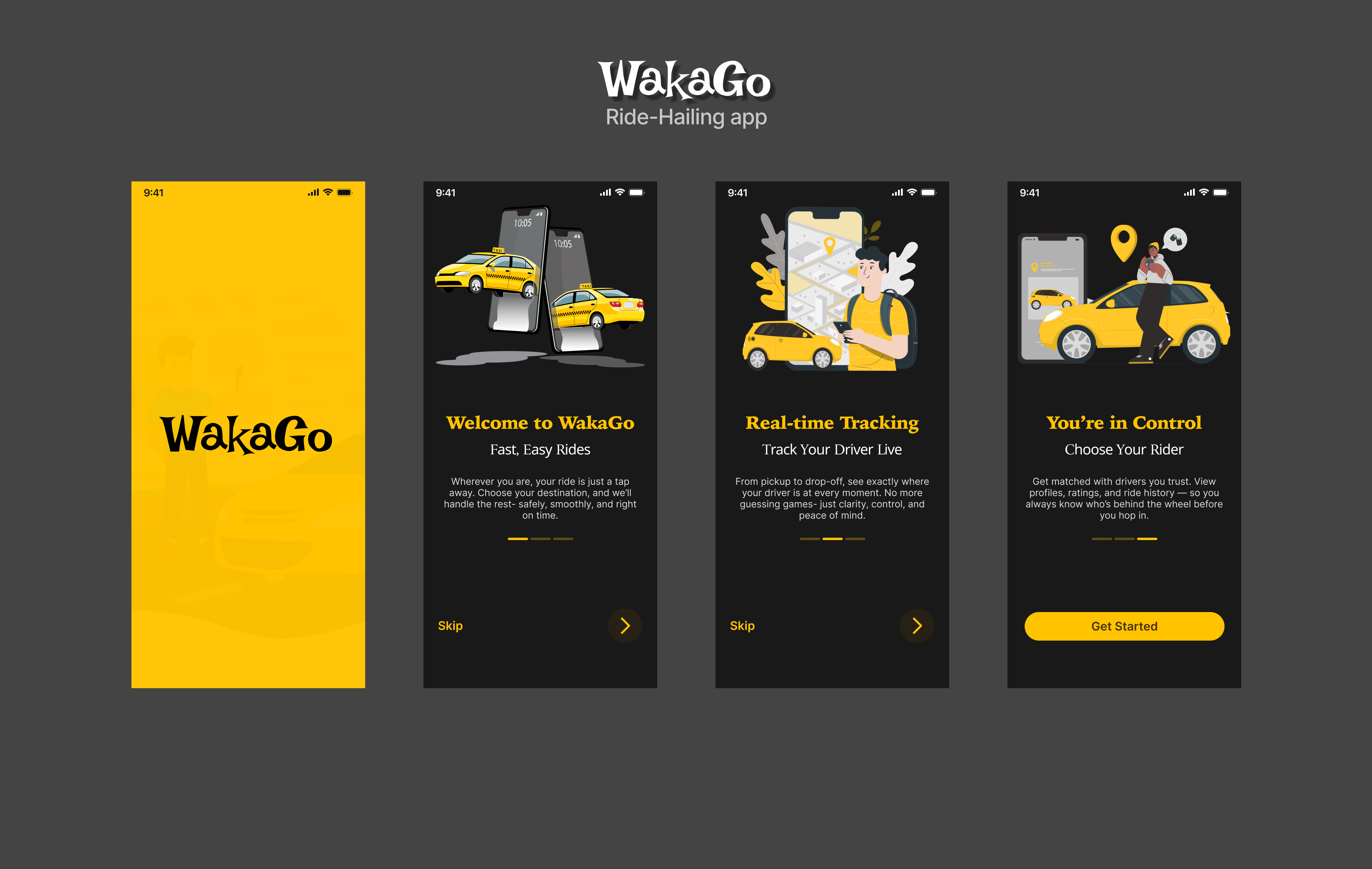
Onboarding Screens
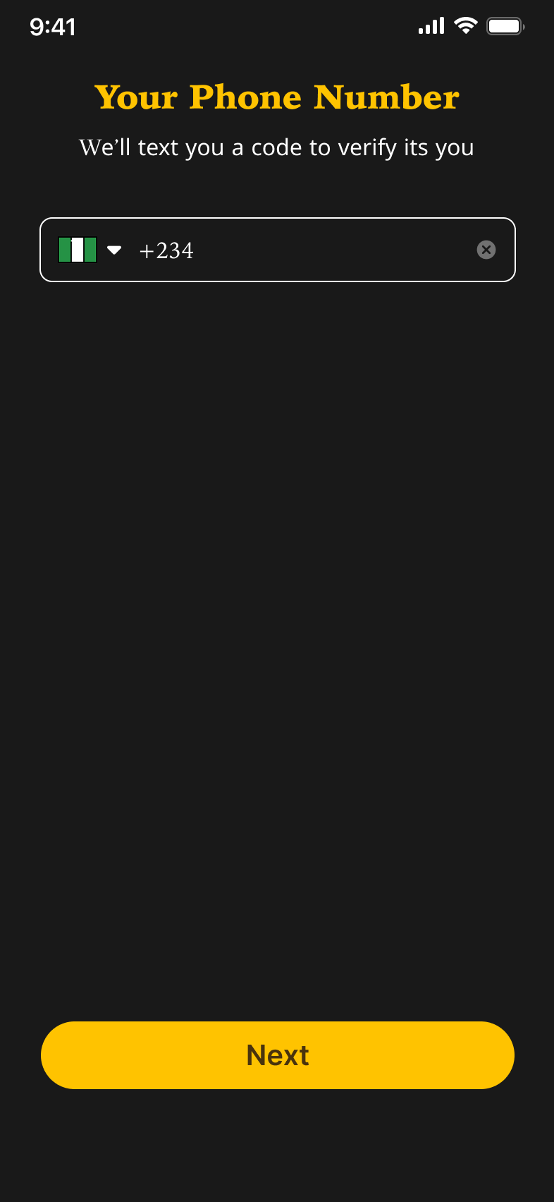
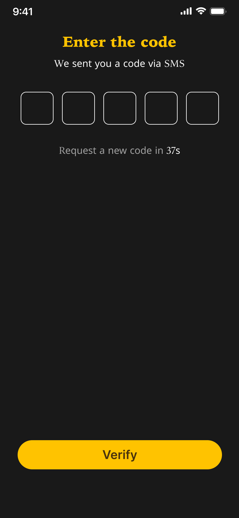
Create & Verify Phone Number
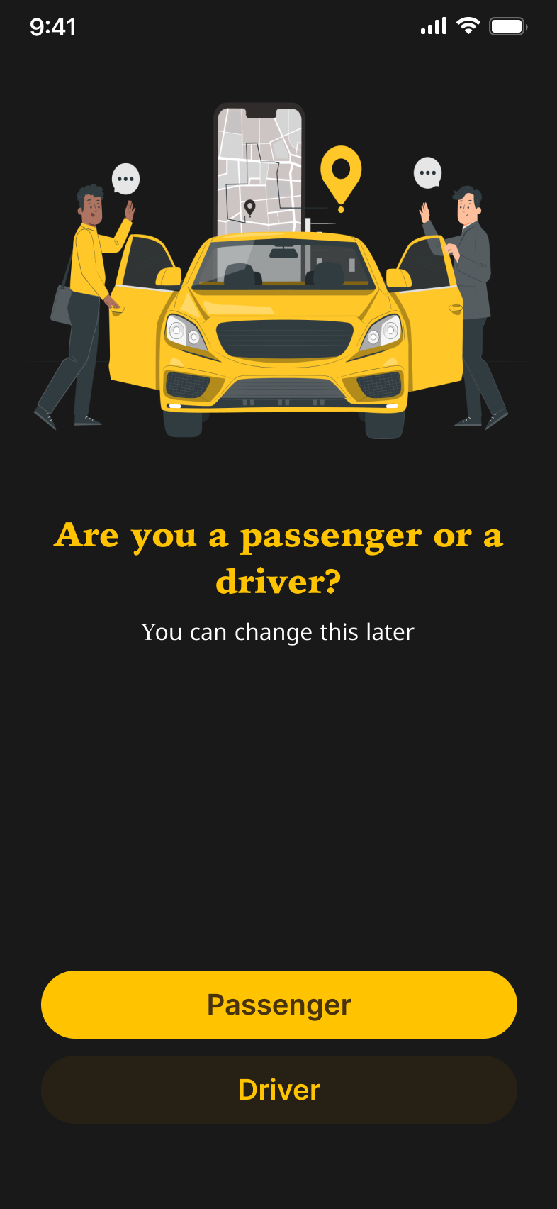
Choose Role – Driver or Passenger
Enter Name Screen
Homepage (Post-login)
Screens Breakdown
1. Onboarding Screens
Visual Style: Bold illustrations, dark backgrounds (#191919), and vibrant yellow CTAs
Messaging: Localized, friendly copy that speaks in relatable tones (“Your waka just got easier”)
Flow: Users swipe through 3 short feature highlights before entering their number
💡 Decision: Keeping onboarding to 3 screens to avoid friction, with the option to skip
2. Create & Verify Phone Number
Input UI: Large numeric input field with country code pre-selected
Verification UI: 6-digit OTP input styled for clarity, auto-advances between fields
Feedback: Clear error states and subtle animation for invalid codes
💡 Design Touch: Phone verification replaces long registration forms-: optimizing for mobile-first users who prefer speed over form-filling
3. Choose Role – Driver or Passenger
After verification, users choose how they want to use WakaGo.
Layout: Screen with illustrations and clear call-to-action buttons
Driver Option: “Driver”
Passenger Option: “Passenger”
Design: Uses contrast-bright yellow buttons against dark background for fast decision-making
💡 Design Insight: Early user interviews revealed some drivers download ride apps intending to register, but are confused by default passenger flows. This screen solves that by offering a clear branching point.
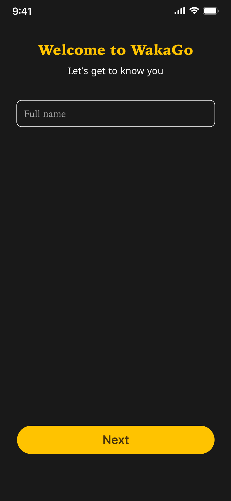
4. Enter Name Screen
Tone: Friendly header (“Let's get to know you”)
Field: Full Name with auto-capitalization and field validation
CTA Button: Bright yellow, centrally placed, responsive on keyboard up
💡 Accessibility: High color contrast and clean font (Inter) make this screen usable across various lighting conditions
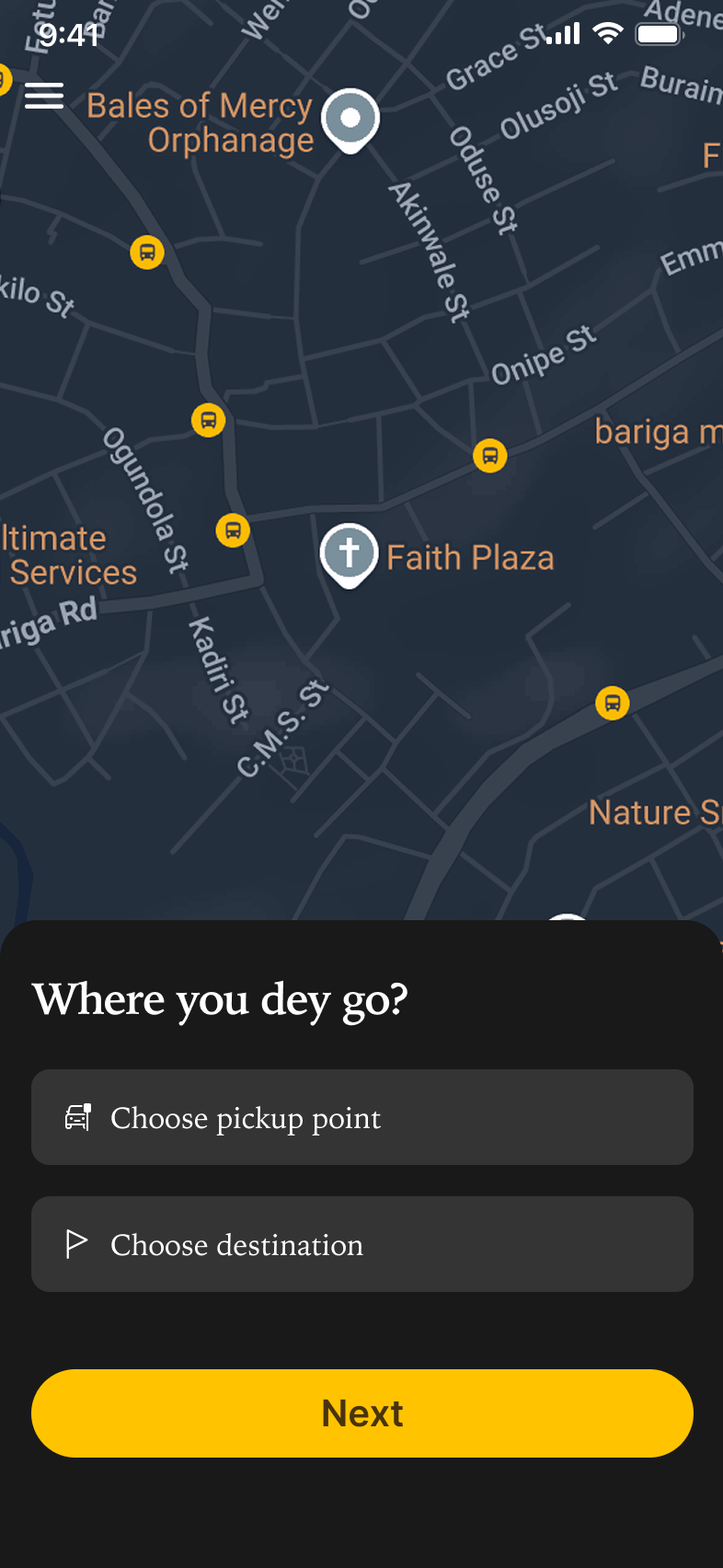
5. Homepage (Post-Login)
Map-Centric UI: The user lands directly on a live map with a location prompt: “Where you dey go?”
Actionable Elements:
Prominent input field to select pickup and dropoff
Button to proceed to find rides
💡 Design Decision: We prioritized getting users straight to booking instead of showing excessive information or promotions
Design Approach
Color Use:
#191919 sets a sophisticated, modern tone
#FFC300 provides vibrancy and immediate visual direction
#49330D used sparingly for depth and hierarchy
Typography:
Irish Grover (logo) gives WakaGo a bold, urban feel
Iowan Old Style adds a formal, reliable presence
Inter ensures high readability in forms and buttons
Voice & Tone:
Informal, confident, and locally flavored
Prioritized familiarity to build user trust from first interaction
Outcomes & Early Feedback
Onboarding completion rate (prototype test): 94%
Avg. time to complete setup: ~38 seconds
Users praised the “friendly and local” tone, and appreciated the minimal steps required to get started
Next Steps
Design ride selection and booking flow
Add profile and payment integration
Implement dark/light theme toggle for accessibility
Conclusion
This phase of WakaGo focused on creating a frictionless entry point for users. By keeping the design intuitive, fast, and visually bold, the app sets a strong tone for what’s to come—a local-first ride experience that feels familiar and empowering from the very first screen.